the pie hole
When the founders of The Pie Hole set out to reinvent American comfort food for a generation raised on fast-casual monotony, they faced a delicious paradox: how to make wholesome, high-quality fare feel as bold and unapologetic as their audience. They didn’t just need a brand—they needed a personality.
I dove headfirst into their world: late-night recipe tests (where "healthy-ish" collided with "hell yes"), debates over how crispy fries should sound when bitten, and a relentless hunt for the perfect balance between nostalgia and rebellion. The Pie Hole wasn’t just serving food—it was flipping the script on guilt-free indulgence.
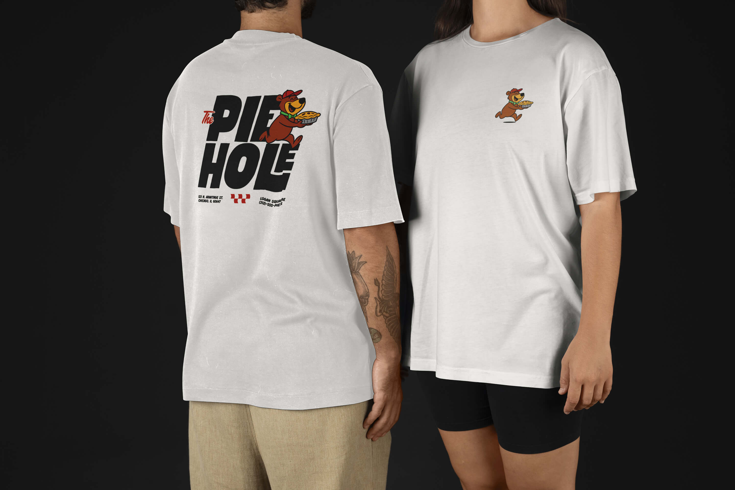
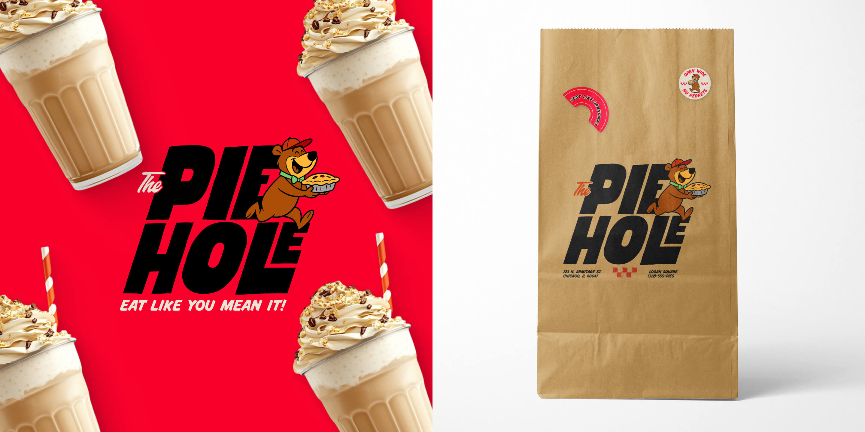
The solution? A brand voice as loud and layered as their menu. Think winking humor ("No sad salads"), sensory-rich descriptions ("burgers that bleed juice, not guilt"), and a visual identity that mashed up retro diner vibes with Gen Z swagger. Custom illustrations of anarchic produce (a radish with a tattoo, anyone?) and unapologetic typography turned their ethos into an experience.
The real test came when a regular, mid-bite into their Lumberjack Pancakes, looked up and said, "This tastes like my childhood—if my childhood had a better soundtrack."
Today, The Pie Hole isn’t just a restaurant—it’s a cultural rebuttal to bland health food and soulless chains. A place where bowls "slay," fries come with "emergency" status, and every bite insists: Eat well. Live loud. No apologies.
brand identity
brand design
experiential design
custom illustration


